
Best Practices for Designing Engaging and Accessible Dark UIs
Dark user interfaces offer an attractive alternative to traditional light modes, with benefits such as reduced eye strain and improved battery life on OLED screens. A well-crafted dark UI can create a sophisticated and immersive experience for users. However, making a dark UI that is both beautiful and accessible takes more than simply inverting color schemes.
Attention to color, contrast, typography, and images is crucial for achieving a design that is both striking and usable. When properly executed, dark UIs can enhance the perception of depth, spotlight essential content, and provide a contemporary feel. Proper design also ensures that all users, including those with visual impairments, can navigate the interface with comfort and ease.
Understanding user preferences is key to the growing adoption of dark mode. Research shows that users are increasingly switching to dark themes for personal comfort, especially at night. Adopting best practices for dark UIs results in products that are inclusive, visually pleasant, and aligned with modern user expectations.
Effective dark UI design is not only about aesthetic appeal, but also about function, consistency, and accessibility. By thoughtfully applying design guidance, you can keep your application competitive and engaging in today’s digital landscape.
Choose Appropriate Background Colors
Pure blacks can make interfaces appear stark and cause visual fatigue, especially in well-lit environments. Designers are recommended to choose deep, dark grays like #121212 or #181818 as the main backdrop for dark mode interfaces. These tones offer a more inviting, refined look while supporting nuanced effects such as elevation and layer differentiation. Choose background colors that balance warmth and neutrality for the best results, as Onething Design explains.
Ensure Sufficient Text Contrast
Clarity in a dark UI is largely determined by text contrast. The World Wide Web Consortium’s WCAG guidelines recommend a contrast ratio of at least 4.5:1 for body text, which promotes readability for all users. Use tools such as the WAVE Chrome extension to check and validate your color combinations. Avoid light grays that may blend into the background and favor off-white (#E0E0E0) or warmer tints for optimal legibility.
Optimize Typography
Dark backgrounds can make thin fonts harder to read, especially at smaller sizes. Use a clear, bold, well-spaced font with a minimum size of 16px and a line height of 1.5. Sans-serif fonts, known for their simplicity and modern look, work particularly well for digital interfaces. Avoid ultra-light weights and experiment with font pairings to introduce visual hierarchy.
Use Muted Accent Colors
Bright, saturated accent colors appear far more vivid against dark backgrounds and can easily become overpowering. Use muted, low-saturation versions of your primary brand colors to maintain a harmonious, sophisticated palette. Limiting color usage helps you guide user attention and reinforce brand elements without causing visual exhaustion. Refer to comprehensive guides on color theory from resources like Nielsen Norman Group for more details about accessible color schemes.
Leverage Negative Space
Dark interfaces can feel cramped when elements are too closely spaced, which adds to a sense of heaviness and clutter. Employ generous padding and margin between sections and around actionable items. Ample negative space not only improves scannability but also fosters a modern, uncluttered experience where important features stand out naturally.
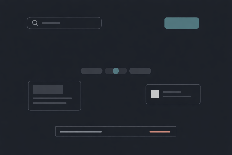
Adapt Images and Illustrations
Many images optimized for light backgrounds lose clarity or clash visually in dark modes. Logos or images with black edges disappear, while those with white outlines create unwanted halos. To ensure cohesion, use transparent PNGs or SVGs, and consider maintaining alternate versions of your key visuals for dark backgrounds. This approach avoids visual inconsistencies and maintains brand integrity across all themes.
Test in Various Environments
Viewing your design solely on a single monitor or in a darkened room will not capture the user’s real-world experience. Dark UIs should be tested across a variety of devices and lighting conditions to detect glare, illegible text, and unintended color shifts. Gathering feedback from user testing sessions can inspire refinements and optimize the interface prior to launch. Engaging in iterative testing can increase satisfaction and minimize accessibility barriers, as Graphic Eagle’s exploration of dark modes demonstrates.
Maintain Consistency Across Modes
A seamless transition between light and dark modes demonstrates care and professionalism. Keep proportions, padding, font sizing, and design elements aligned across both themes. Avoid unexpected shifts in visual hierarchy or spacing when users toggle between modes. Consistency instills user confidence and supports a premium brand impression.
By adhering to best practices in dark UI design, you will create interfaces that are accessible, visually compelling, and easy to use for everyone. Attention to essential design principles, such as careful color selection, sufficient contrast, and adaptable visuals, contributes to experiences that users will appreciate, regardless of their environment or preferences.
